

Sure you can, why not? Our pricing is structured to reflect the costs that are…

20 Common Design Mistakes You Should Avoid
It’s easy to get caught up in the excitement of a new design project. Design brings opportunities to exercise our creativity and skill, but along with that designers face many challenges that may not be obvious. Here are 20 mistakes you should avoid during the design process.
1. Not Understanding the Project
Understanding the client, purpose, and audience will help you create the most effective design. To help roadmap your design project, we’ve created a design brief to help research with the client.

2. Using the wrong typography
Make sure to choose a font that’s appropriate for your purpose. Some fonts like Comic Sans and Lobster are so overused that your design may be lost among other pieces. Be aware of copyright laws, as well. Many fonts are copyrighted, so make sure you’re able to use it in your design without legal issue.
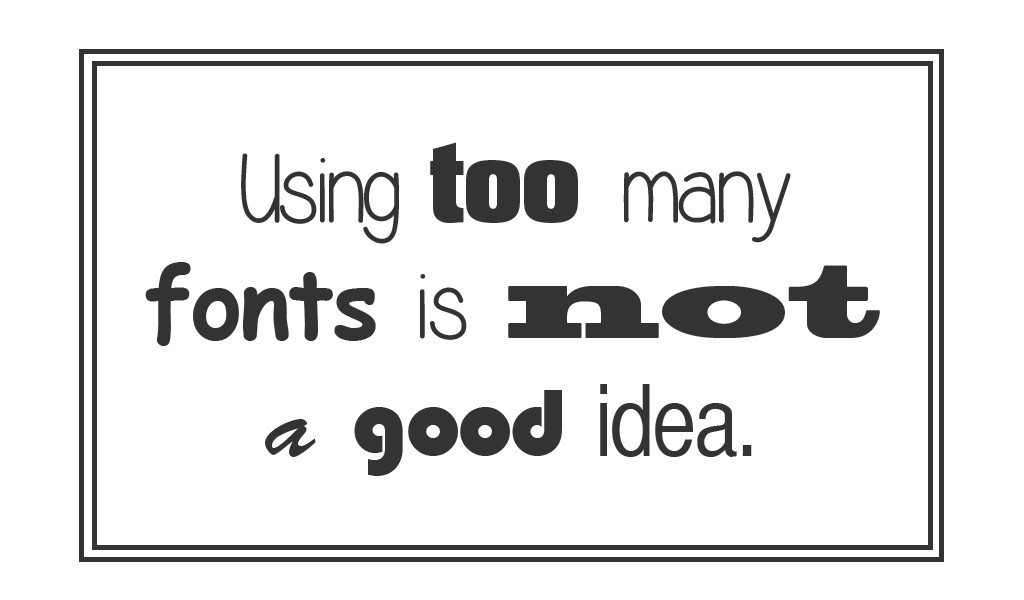
3. Too Many Fonts
The optimal amount of fonts for any design is two. Adding more fonts can make a piece look cluttered and directionless. It’s best to choose a font you want to communicate the information, and one for style accents.
4. Too many stock images
Stock images can add professionalism to a piece, but too many can make something look cold or cluttered. Often times when people notice too many stock photos, it takes away from the credibility of the organization, making them look like they’re an entirely fabricated entity.
5. Poor layout
Pieces with poor layouts run the risk of being unreadable, and unclear. Make sure you set up your information so someone can read through it logically. If you feel like you don’t know where to begin, try out the free templates at Canva.com.
6. Not saving files correctly
This is a more common occurrence than most people would realize. Following a simple checklist or procedure every time is the best way to ensure that the files you’re saving can be used properly in the future.
7. Failing to proofread
Proofreading can prevent embarrassing mistakes for you and your client. Make sure to check words you’re unsure about (a quick google search works really well for this), and print out a hard copy to see it fresh in a different context.

8. Working destructively
When working with files, it’s smart to ensure that the original elements are still usable in the future. It helps to keep the original files in separate folders, use layers while editing, and version your files so it’s easy to go back if you have to.

9. Not handing over properly to client/other stakeholders
Make sure you hand over files in a professional manner. Make sure that the client has all the packaged InDesign files, or other native files. This gives flexibility to the client, especially if they’d like to make small changes on their own, or if would like to be able to use it with different collaborators.
10. Failing to checklist (Not having a plan)
Having a checklist for each design project can help you ensure that you’re not missing any important steps. Also, having another person look over your work can help in case there’s anything you might have missed.
11. Not considering context
Sometimes different phrases can mean different things when they’re said out loud versus read. A speaker may mean a “telephone poll,” but a listener might think of a pole they see on their street instead of a survey over a cell.

12. Copying other people’s designs
Walgreens hasn’t decided to protect its logo with the Nationals like it did with Wegman’s, but these look a bit too close for comfort.

13. Poor use of QR codes or shortcodes
We’re not big fans of QR codes due to their poor adoption and ROI, and then even more due to design choices like this. You wonder if this was client approved.

14. Poor trends
Trendy design has the same effect has trendy clothes, they may be the popular for a little bit, but they don’t have the longevity to be worth your while. Make sure if you’re following a trend, it’s a well thought out decision that works for your purpose.

15. Failing to use shortcuts
Learning the tools of your craft can save you a lot of time in the future. Using shortcuts in the Adobe Suite, or making actions for steps you do commonly can help you streamline your process. Also, if there are pieces you commonly see on your work, make a few templates for future use.
16. Missing the point of design
Remember that the end result of a design is to communicate something or function with purpose. Of course you’d like your piece to be eye-grabbing, but don’t do it at the cost of functionality and clarity.
17. Using Rasters vs. Vectors
When designing something to be used at various sizes, use vector graphics instead of raster images. This way if your image is enlarged, it won’t lose any fidelity.

18. Poor Kerning
Kerning is the space between two letter pairs. Poor kerning, aside from being painful on the eyes, sets apart the work of a professional designer vs. that of a “wannabe” designer.

19. Center Aligning chunks of text

20. Not enough white space

Related Posts


